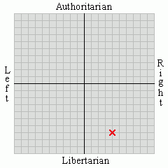
UPDATE: Well here's one change I'm not happy with. I found this content advisory thingie at Uncle Bill's, and having just added him to the blogroll it seemed like a good time to half inch it.

Aside from the point that it links to a dating site, which shouldn't bother me but for some reason I can't explain does anyway, I'm disappointed in only getting a 17 rating. Clearly I need to drop the c-bomb a lot more and mention bestiality, devil worship, two girls one cup, and that George W. Bush is my person of the year. Bear with me while I check...
... nope, still the same. Apparently that rating is
...determined based on the presence of the following words:'Slap'? I could be talking about Mrs Exile's make up. 'Fucking' and 'fuck' I'm certain are both underscored, probably missing a zero on the end each. Much the same could be said for 'cunts' and 'bastards' while I feel 'kill' and 'crap' may be exaggerated. Oddest of all is fags - does that push my rating up because of anti-smoking hysteria or homophobia or both? Either way, fuck it, it's coming off the sidebar. I still think there probably ought to be a better content warning that I have so I may put it into the header image.
fucking (34x) fuck (22x) gun (8x) bastards (7x) crap (5x) fags (4x) kill (3x) cunts (2x) slap (1x)
UPDATE 2: That bloody tag cloud is going to be a pain in the arse.


3 comments:
Considering ditching the dumb thing myself. In terms of interactivity it's about as pointless as the proverbial broken pencil.
The thre column layout looks fine to me. Some seem to set the middle column too narrow, but this one doesn't look cramped at all.
'crap' and 'slap'? Good lord...
Thanks for the feedback. It's growing on me slowly. I still have a few tweaks in mind, such as making it a little wider to accommodate column margins a few px wider. And since that would mean redoing the header image I'm pretty much decided on adding a content warning if I do.
Post a Comment